Too bad cheering on a render can't make it go any faster. But that's the way it goes sometimes. Almost makes me wish I had at least two decent computers instead of one. So that way one could render and the other could be used for other productive stuff. (Not sure if web browsing or chat could be considered that productive, but at least I can do those two and leave 99% of the other cycles free for Carrara to render on.)
I think I'll have a really spiffy airplane pic once it's all done though. Hopefully the volumetric clouds assigned to a particle emitter in order to produce a believable smoke trail are worth the wait.
Thursday, June 26, 2008
Wednesday, June 18, 2008
The better "Ebony" pencil is...
If you like to draw the ol' fashioned way on occasion, sometimes you go to the art store and buy pencils and such...
Anyhow I went and got some extra "Ebony" pencils, because they draw nice and dark and fairly smoothly without a lot of pressure. So when doing quick random sketches, they're hard to beat.
You would think they're all the same, but there happens to be more than one brand with that label or designation. I found in my own testing that the Eberhard Faber ones draw just a bit darker and smoother than the Sanford ones.
So take note if you see both brands available at an art store, the Eberhard Faber ones are better. (At least for the "Ebony" type pencils. Your results and consistency may vary for other types.)
Monday, June 16, 2008
Thinking of some page design stuff...
I'm wondering about something now in regards to web page design. It seems like the trend is that monitors will be getting higher and higher resolution in the future. It is such now that XGA size is the most common (which is good, since I like it. It's sharp enough, yet refreshes plenty fast). But in the future even that will be towards the SVGA and VGA side of display resolutions. Also the market for widescreen aspect monitors is going up, so even that has to be thrown in the mix in addition to the 4:3 ratio screens.
Why is this a problem? It will make things more difficult to design properly by the pixel. What looks good on one screen will look itty-bitty on a high-res display, and will bleed off the viewed page in a horrible manner on a lower-res display. What can be done about this?
But I've noticed one thing that's really cool in the latest and greatest (as of this blog post) Firefox 3. When you use the page zoom feature, it properly scales the images in addition to the text. And the browser rendering seems to be able to do so in a smoother manner than forced sizing of the past. (Doesn't tend to get too blocky scaling up, nor aliased/oversharp looking scaling down.) What does this mean? Well, I'm thinking that HTML/CSS should (if not already does) support declaring image sizes by pts, inches, mm, or other sizes independent of actual pixel resolution. So you can have a 1"x1.5" pic on a page regardless of screen resolution. Throw in font size set by pts instead of px, and the layout stuff becomes a lot more consistent. Almost like print.
Now there is one downside I could think of too this, but it falls upon either the stupidity/ignorance of the OS or even the computer user. And that is an improperly set display dot pitch ratio. If it's wrong, the images on their screen will not scale properly to the physical space on the screen. Currently a lot systems assume 72dpi for screen display, but this is obviously wrong. A lot of newer stuff is more like 96 or 120dpi, and can even go higher for those occasional crazy-big monitors. But then again, I think some newer setups have more plug n' play built to correct this... So designing a page to dimensions rather than pixels may be the sensible way to go.
Friday, June 06, 2008
Flashitool raid! (Part II or whatever)
Some more fun with Flashitool. Maybe they won't find out it was meeeee. *Grin* Oh wait, this gets indexed on google pretty quickly, doesn't it? Oh well. Anyhow, if it was your site I raided - I hope you don't mind too much.
Here's the latest works that I did which I thought were halfway decent.
Here's the latest works that I did which I thought were halfway decent.
Wednesday, June 04, 2008
Randomness video
I'm having fun trying to make some Flash video to some random thing I found on Archive.org. It's going to be pretty funny when it's finished. Here's a little exerpt of it showing the current progress.
Tuesday, June 03, 2008
Sphereical UV mapping in Wings3D
UV mapping is quite a powerful, if not well understood aspect of Wings3D. Someone asks, "How is spherical mapping done?" So here's a quick overview of the process.
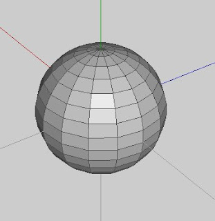
First start with an object that terminates with a pole on each end. Yeah, it's called "spherical" mapping, but it should work with anything that has poles on the ends. (But a sphere is typically the most obvious thing that terminates in poles on both ends when it comes to polygonal 3D modeling.)
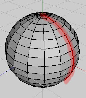 Select the sphere in object mode, then click UV Mapping. You should get a segmenting mode window. For spherical mapping to work, just select a single line of edges that terminates at both poles. Mark these edges for cut in the segmenting window.
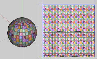 Right click, and pick continue. For mapping, pick spherical. You should get something like this. If you don't mind extreme pinching at the poles in the your map, you could finish it like this. I'll show you how to relax the pinching by a bit. (Although not perfect, it's better than none.)
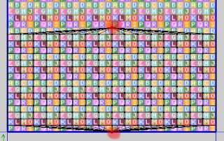 Select the pole vertices in the chart like so.
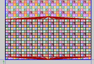 Then switch to edge mode. It will automatically select the edges that are connected to the vertices you had selected in the previous step. Hit alt-L to extend the edge selection by one segment for all selected edges.
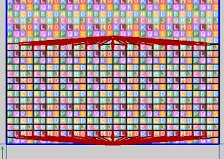 Then right click and pick cut. You should notice some slight spacing between the edges you had selected.
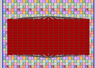 Select the whole chart in object mode, move to center, and scale to 90%. This will give a little room to work with around the map.
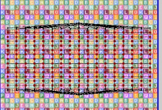 Select all the vertices as seen in the pic. Notice how the verices that are along the edges that were cut apart earlier are not selected.
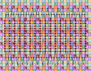 Now without deselecting those vertices, chose unfold from the right-click menu. If you did it right, you should have something like the above pic. It's actually not too different from Mercator (I believe that's the method) mapping of a globe. By no means perfect, but it relaxes some of the distortion going to the poles.
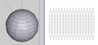 When done creating the texture, you should have something like the above pic. Now that wasn't too hard, was it? Easy peasy really.

First start with an object that terminates with a pole on each end. Yeah, it's called "spherical" mapping, but it should work with anything that has poles on the ends. (But a sphere is typically the most obvious thing that terminates in poles on both ends when it comes to polygonal 3D modeling.)
 Select the sphere in object mode, then click UV Mapping. You should get a segmenting mode window. For spherical mapping to work, just select a single line of edges that terminates at both poles. Mark these edges for cut in the segmenting window.
 Right click, and pick continue. For mapping, pick spherical. You should get something like this. If you don't mind extreme pinching at the poles in the your map, you could finish it like this. I'll show you how to relax the pinching by a bit. (Although not perfect, it's better than none.)
 Select the pole vertices in the chart like so.
 Then switch to edge mode. It will automatically select the edges that are connected to the vertices you had selected in the previous step. Hit alt-L to extend the edge selection by one segment for all selected edges.
 Then right click and pick cut. You should notice some slight spacing between the edges you had selected.
 Select the whole chart in object mode, move to center, and scale to 90%. This will give a little room to work with around the map.
 Select all the vertices as seen in the pic. Notice how the verices that are along the edges that were cut apart earlier are not selected.
 Now without deselecting those vertices, chose unfold from the right-click menu. If you did it right, you should have something like the above pic. It's actually not too different from Mercator (I believe that's the method) mapping of a globe. By no means perfect, but it relaxes some of the distortion going to the poles.
 When done creating the texture, you should have something like the above pic. Now that wasn't too hard, was it? Easy peasy really.
Subscribe to:
Comments (Atom)

